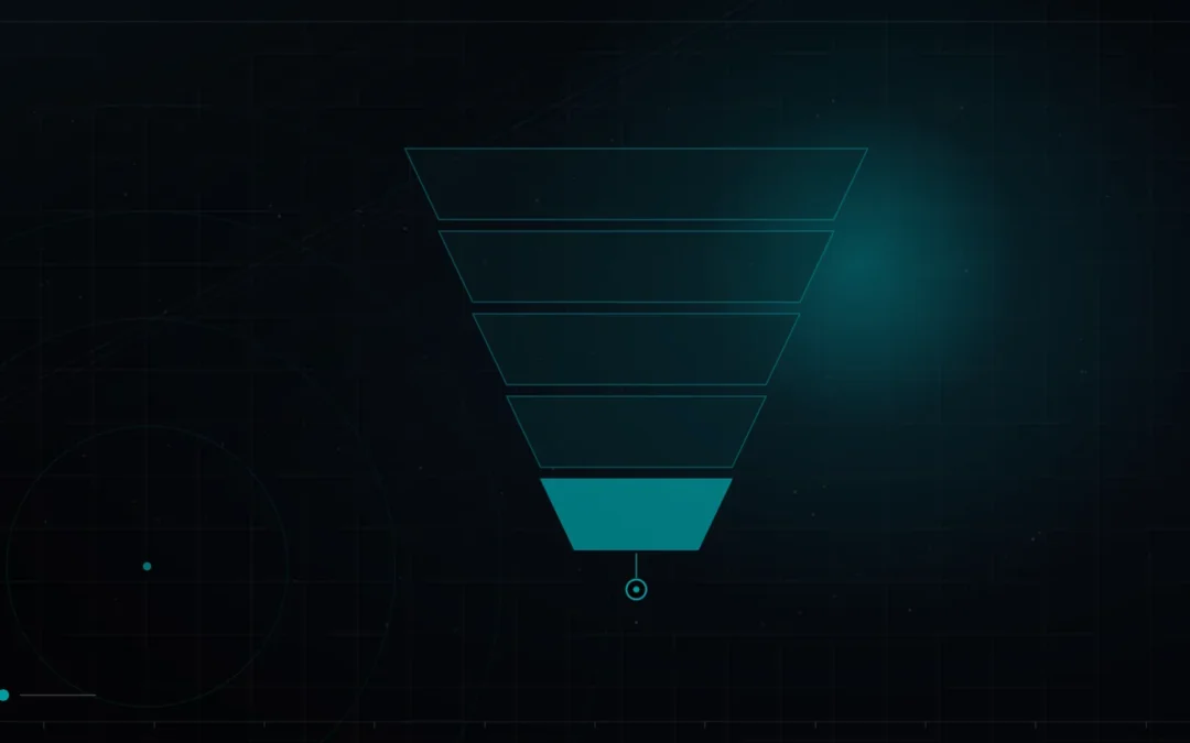
A landing page that sells follows a proven structure that answers the visitor’s questions in the order they naturally ask them, from top to bottom. It opens with a clear headline stating the single most compelling benefit, a subheadline that clarifies and supports it, and a primary call to action visible without scrolling. Below that it lays out the benefits, meaning what the visitor gains rather than just features, then social proof such as testimonials, client logos or numbers to build trust, then a simple explanation of how it works and answers to the main objections, a short FAQ, and a final call to action to catch anyone ready to act at the end. The guiding principles are one goal per page, clarity over cleverness, benefits over features, and visible proof. You do not need to be a brilliant designer; you need to be clear, credible, and to guide the visitor to one obvious next step.
High-converting landing pages are not works of creative genius; they are well-ordered answers to the questions a visitor is silently asking. Once you see the structure, you can build a page that sells without guessing. Here is the anatomy, section by section, and the principles that hold it together.
Why structure beats cleverness
The instinct on a landing page is to be clever, catchy headlines, unusual layouts, but visitors do not reward cleverness, they reward clarity and reassurance. A person arriving on your page is quietly asking a sequence of questions: what is this, what do I get, can I trust you, how does it work, and what do I do next. A page that sells simply answers those questions in that order, clearly and credibly. This is why structure beats flair: the proven layout is proven precisely because it maps to how people actually decide, and a clear page built on it will almost always outperform a clever page that leaves questions unanswered.

The anatomy, section by section
Each section has one job, and together they walk the visitor from arrival to action.
| Section | Its job | Key to getting it right |
|---|---|---|
| Headline | State the main benefit clearly | Clarity over cleverness |
| Subheadline | Support and clarify the promise | One clear supporting sentence |
| Primary call to action | Give the obvious next step | Visible without scrolling |
| Benefits | Show what the visitor gains | Benefits, not features |
| Social proof | Build trust and reduce risk | Real, specific proof |
| How it works and objections | Remove remaining doubts | Answer the real questions |
| FAQ | Handle final hesitations | Address them, do not dodge |
| Final call to action | Catch ready buyers at the end | Repeat the single action |
Benefits over features, always
The most common content mistake on a landing page is describing what your product is rather than what it does for the visitor. A feature is a fact about your offering; a benefit is the outcome the visitor gets, and people buy outcomes. Every feature you list should be translated into the change it makes for the reader, so that instead of a specification they see themselves better off. This is not spin, it is relevance: the visitor genuinely cares about their problem being solved, not about your feature list, and a page that speaks in benefits meets them where their attention actually is. Lead with the outcome, support it with the feature that delivers it, and the same product suddenly reads as far more compelling.
Proof is what closes
You can make every claim on your page, but the visitor has no reason to believe you until someone else vouches for it, which is why social proof does so much of the selling. Testimonials from real customers, recognisable client logos, concrete numbers, results, ratings, quantities, and any credible third-party validation all reduce the perceived risk of saying yes. Proof works because it shifts the claim from you, an interested party, to others who have no reason to flatter you, and that shift is often what tips a hesitant visitor into acting. Place proof near your key claims and calls to action, where doubt is highest, and be specific, because a precise, believable detail persuades far more than a vague boast of quality.
The smallest first step
Take your current page and check it against the sequence of questions a visitor asks: is the main benefit clear in the headline, is there one obvious action, do benefits outweigh features, and is there real proof near the decision. Fixing whichever of these is weakest usually lifts conversions more than a full redesign, because you are repairing the specific point where visitors currently lose confidence or clarity. A page that sells is built one clear answer at a time.
Frequently asked questions
How long should a landing page be?
As long as it needs to answer the visitor’s questions and no longer, which depends on the complexity and price of what you offer. A simple, low-risk action needs little; a considered, higher-value decision needs more proof and explanation. Let the questions a visitor would reasonably ask determine the length, rather than a fixed rule about long or short pages.
What is the difference between a feature and a benefit?
A feature is a fact about your product, while a benefit is the outcome or change it creates for the customer. “Encrypted storage” is a feature; “your data stays private” is the benefit. People decide based on benefits, so translate every important feature into the concrete result it delivers for the reader rather than listing specifications on their own.
How many calls to action should a landing page have?
One goal, repeated as needed. You can place the same call to action several times down the page, at the top, after the proof, and at the end, but they should all drive the single action you want. Competing calls to action that offer different next steps split attention and lower conversions, so keep the page focused on one decision.
Do I really need testimonials and social proof?
In almost all cases, yes, because visitors discount claims you make about yourself and trust evidence from others. Testimonials, client logos, numbers and ratings reduce the perceived risk of acting and often do more persuading than your own copy. If you are new and lack proof, use whatever credible signals you have, and prioritise gathering more, because it is one of the strongest conversion levers.
Does the same structure work for every landing page?
The underlying sequence, promise, benefits, proof, objections, action, is remarkably consistent because it mirrors how people decide, though the emphasis shifts with the offer. A simple sign-up leans on clarity and a fast action; a high-value purchase leans harder on proof and objection handling. Adapt the weight of each section to your situation, but the order and the principles hold widely.

Build pages that answer, in order
A landing page that sells is a clear, ordered answer to what the visitor is quietly asking, built on structure rather than cleverness. When the traffic is paid, the same anatomy gains the message-match focus set out in landing pages for paid traffic, judging whether your page performs means checking your conversion benchmarks, and knowing where visitors actually drop off depends on GA4 conversion tracking. How much traffic to send it, and from where, is the wider question in lead generation in Doha. Book a free 30-minute call through the contact page and we will build you a page that sells, with no pressure either way.